Tag Archives: south asia

Eurasian ChromoPainter Chunk Counts

Continuing with the Eurasian ChromoPainter analysis, here is the zip file containing the chunk counts that were donated by an individual in a column to an individual in a row. Please note that this is an all-against-all analysis, so it does not directly show the direction of gene flow. Also, the IDs I used here are based on ethnicity (except for harappann which are mixed Harappa Project participants). If you want to find out your ethnicID, take a look at this spreadsheet which has the appropriate mapping.

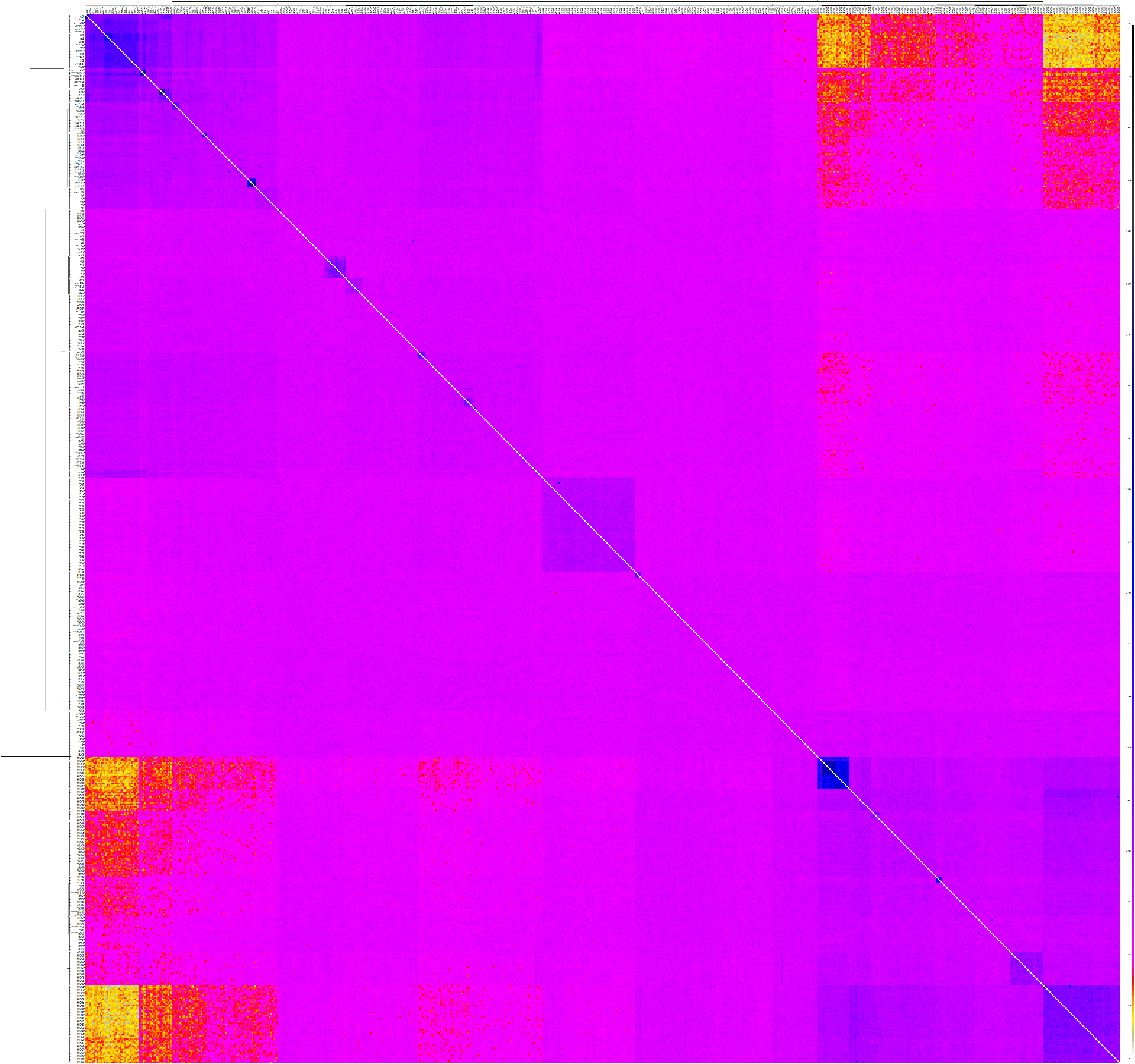
Since fineStructure classified these 2,001 individuals into 203 populations, it's easier to look at the chunk counts averaged over these populations.

From top to bottom (recipient) and left to right (donor), the five major branches are South Asian, European, Near Eastern & Western Asian, Inner Asian/Siberian, and East Asian respectively.

This population chunk count data is available in a spreadsheet.

Now, let's look at some specific recipient clusters/populations.

Here's the top 50 populations that have donated chunks to the Kalash (Pop133).

The three bars at the bottom are for the 3 different (closely related) Kalash clusters. The clusters donating the most after that are the Burusho, Sindhi, Pathan, etc. The top non-South Asian donor (Tajik Pop116) is at #21 and the next one is also Tajik (Pop95) at #38.

Now here are the top donors for the Pathans (Pop148).

Interestingly, the number of chunks donated to Pathans from Balochi, Brahui and Sindhi seems to be a bit more than from Punjabis. Again, Tajiks are the closest non South Asian group at #55 and #59, followed by Kurds at #62 and Iranians/Kurds cluster (Pop172) at #63.

Now let's look at the donors for Pop134 which includes 2 Bhatia, 2 Gujarati-B, 3 Haryana Jatt, 1 Kashmiri, 4 Pathan, 5 Punjabi, 1 Punjabi Brahmin, 5 Punjabi Jatt, 2 Punjabi Ramgarhia, 1 Rajasthani Brahmin, 1 Sindhi and 3 Singapore Indians.

The top donors (other than Punjabis, of course) are Sindhis and Gujarati-B. The top non South Asian donors are Tajiks at #65 & #67, Iranians/Kurds at #69, Turkmen at #70, Kurds at #73 and Lezgin at #75.

Now for Pop181 (2 Baloch and 9 Brahui).

The Baloch/Brahui are more inbred compared to Punjabis and Pathans. After teh top donors from Baloch, Brahui and Makrani, we get Sindhis, Pathans, Velama and Punjabis. The top non South Asian donor populations are Iranian/Kurd at #28, Turkmen at #33, Turk/Kurd (Pop162) at #35, Iranian Jews at #39, Kurd at #41, a lone Saudi at #42, Iraqi Jews at #43, Tajik at #44, Drue at #47, Armenians at #48, and Samaritian at #50. So it seems like Baloch and Brahui are a lot more West Asian than other groups in Pakistan/NW India.

Let's look at the donors for Pop129 (1 Tamil Nadu Brahmin, 4 Iyengar Brahmin, 8 Iyer Brahmin, and 9 Singapore Indians).

The top donors, after Pop129, are Iyengar Brahmins and a group consisting of other South Indian Brahmins, Kerala Christiand and Nairs, and then Velama. The Dusadh are the top north Indian donor, followed by Gujarati-B and Chamar. Top non South Asian donor is Tajik at #73.

Now for the top donors for Pop188 which includes 33 Singapore Indians, 4 Tamil Vellalar, 3 Andhra Pradesh Reddy, 2 Andhra Pradesh, 2 Dusadh, 2 Karnataka, 2 Sinhalese, 2 Tamil Nadar, 2 Tamil Nadu Scheduled Caste, 1 Chenchu, 1 Kerala Christian, 1 Kerala Muslim, 1 North Kannadi, 1 Tamil Muslim, 1 Tamil Vishwakarma and 1 Velama.

The top donors are Sakilli, Piramalaikallar, and Velama. Their top non South Asian donor is a group of 5 Singapore Malays at #72, followed by Romanian and Serbian Romany at #73.

Finally, let's see which clusters are the top donors for Paniya (Pop65) who get the most South Indian component in my HarappaWorld Admixture runs.

Their top donors are Paniya, Malayan, Pulliyar and Kurumba. Their top non South Asian donors are Singapore Malays at #55, Burmanese at #59, and Cambodian/Singapore Malay at #64.

Eurasian fineStructure Dendrograms

The dendrogram in the last post about Eurasian ChromoPainter/fineStructure analysis is a little hard to make sense of, so here is the same info in a better format.

First, the upper portion showing the relationship of the five branches:

Now, let's take a look at Branch1 which consists of South Asians:

Branch2 is European.

Branch3 is mostly the Near East and western Asia.

Branch4 is Inner Asia/Siberia.

And Branch5 is East Asian.

Note that the leaf labels consist of ethnicity followed by the number of that group who belong to that particular cluster. However, some of the labels are cut off in the images since they were long.

Eurasian ChromoPainter Analysis

Some months ago, I decided to run a big ChromoPainter analysis of the Eurasian samples I have. I removed from my dataset not only all Sub-Saharan Africans, but also North Africans and anyone else with more than 2% African admixture (which unfortunately included me).

Since the number of samples was still too large, I picked 25 random individuals from each non-South-Asian ethnicity while keeping all South Asians. I also tried to remove all close relatives and those with a high missing genotyping rate.

In the end, I had 254,576 SNPs for 2,001 samples belonging to 197 ethnic groups.

I ran ShapeIT to phase their genomes and then ChromoPainter and fineStructure. The whole process took about 2 months.

Then I got busy and the results sat on my computer for more than a month.

Now let's look at the ChromoPainter/fineStructure analysis. Due to my time constraints, I am going to present them in several posts.

Today, let's look at the fineStructure clustering run on the chunkcount output of ChromoPainter. It divided the individuals into 203 populations. Here's the spreadsheet containing the group and individual population clustering.

And here is the dendrogram showing the relationship of the clusters/populations computed by fineStructure.

UPDATE: Better dendrograms

HarappaWorld Ancestral South Indian

Using the same method as I used for reference 3 admixture, I decided to guesstimate the Ancestral South Indian proportions, as given by Reich et al, for my HarappaWorld admixture run.

Basically, I used the 92 (out of the 96 samples Reich et al used) to find population averages for the South Indian component. Then, I used linear regression between the South Indian component average and Reich et al's estimate of Ancestral South Indian (ASI) ancestry. Since Reich et al actually list Ancestral North Indian percentages in their paper but their model is a two-ancestry ANI+ASI one, I simply calculated the ASI percentages as 100% minus ANI.

The correlation between Reich et al ASI and my HarappaWorld South Indian component for the relevant populations turns out to be 0.99277086.

And the linear regression fit for the data is:

ASI = 2.5218942 + 0.8104836 * S_INDIAN

where both ASI (Reich et al) and S_INDIAN (HarappaWorld) are given in percentages.

Of the individuals in HarappaWorld, I kept only those who had a South Indian component of at least 20% for computing the ASI proportions.

The resulting ASI percentages can be seen in a spreadsheet.

Please note that in the Group sheet, the averages are based on the samples which met the 20% South Indian component threshold. Thus, the 20% ASI in the Romanians is the average of the two Romanians who met the threshold out of a total of 16 Romanian samples.

The individual results are available in the Individual sheet. These results are a little different from the estimates using reference 3. Thus, I would point out that these should be taken only as a rough estimate.

Participation Changes

Now that I have DIY HarappaWorld out, I am changing the participation requirements a little bit with somewhat different requirements for South Asians compared to other regions.

If you have any real ancestry from a South Asian origin, you are eligible to participate. Partial South Asian ancestry is okay. The list of countries of origin I count as South Asian are as follows:

  • Afghanistan
  • Bangladesh
  • Bhutan
  • India
  • Maldives
  • Nepal
  • Pakistan
  • Sri Lanka

Note that 2-3% South Asian from Dr. McDonald's BGA or Dodecad Project does not count as South Asian ancestry.

If you have all four of your grandparents from one of the following countries or regions, you can also send me your data.

  • Burma
  • Tibet
  • Uyghur from Xinjiang, China
  • Tajikistan
  • Kyrgyzstan
  • Kazakhstan
  • Uzbekistan
  • Turkmenistan
  • Iran
  • Turkey
  • Azerbaijan
  • Armenia
  • Georgia
  • North Caucasian Federal District, Russia
  • Iraq
  • Syria
  • Lebanon
  • Jordan

Relatives will only be accepted when they are a better replacement for current participants. For example, replacing a participant by his/her parents or his maternal uncle and paternal aunt gets us two unrelated participants (assuming, of course, that the two sides of the family are not related by blood). Another example could be if a participant is of partial South Asian ancestry and they get replaced by a relative who has more South Asian ancestry.

Everyone else can use DIY HarappaWorld. It's fairly easy to use on both Windows and Linux. The only hard part right now is that you have to install R to standardize your genome file. I might look into creating an executable for that to make it easier.

Finally, please be honest.

South Asian fineStructure Ref3 Admixture

I was wondering what the admixture patterns of the clusters fineSTRUCTURE computed were for my South Asian run. So I computed the average admixture for each cluster (total: 89) using reference 3 admixture results.

The default order of the clusters is to keep the closer clusters together.

Dense South Asian ChromoPainter

I had run ChromoPainter/fineSTRUCTURE for 715 South Asians using only about 90,000 SNPs. I thought it would be a useful exercise to use more SNPs, so I had to drop the Reich et al dataset. That left me with 615 individuals and 418,854 SNPs.

The "chunkcounts" file has the donors in columns and recipients in rows. Here's a heat map of the same.

fineSTRUCTURE classified these 615 individuals into 89 clusters. I have named these clusters for convenience, however, the names do not imply that anyone in the Punjab cluster is Punjabi.

While I created the cluster tree at the top of the spreadsheet, here's how the clusters are related.

The most interesting thing is how Gujarati A (likely Patels) are an out-group to everyone else. Another major grouping is that of the Baloch, Brahui and Makrani, along with 4 Sindhis (might be one of the Baloch tribe of Sindh?).

The Punjabis, Sindhis and Pathan get better classification here than they did last time.

The Punjab cluster includes 3 Gujarati B, 4 Pathans, 2 Singapore Indians, Punjabis, Haryanvis, Kashmiris, and a Rajasthani Brahmin. Even using this method, HRP0036, who is half-Sri Lankan and half-German/Polish was classified in the same cluster.

The Dharkar and Kanjar could not be separated at all here. According to Metspalu:

There are three second degree relatives groups in our sample: ..snip.. [Kanjar evo_37 and Dharkar HA023]. Again the last pair needs further explanation. The Dharkar and Kanjar practice a nomadic lifestyle and were living side by side at the time of sampling. As the ethnic border between the two is permeable we cannot rule out neither our error during sample collection and/or subsequent labelling nor shifted self-identity.

The inter-cluster heat map:

And you can see the chunkcounts donated from each cluster to recipient individuals in a spreadsheet.

The pairwise coincidence:

And the PCA plots:

ChromoPainter/fineStructure South Asians

You have probably heard of ChromoPainter/fineSTRUCTURE by now (Eurogenes, Dienekes, MDLP and Razib).

So I decided to run the South Asian samples data which I had earlier done PCA/MClust on through ChromoPainter and fineSTRUCTURE.

Here is the coancestry matrix among the 715 participants visualized as a heat map.

UPDATE: Here's a huge image showing the same.

fineSTRUCTURE can use this coancestry matrix to classify individuals into clusters, 52 in this case (compared to 38 using PCA and MClust). You can check the cluster assignments in a spreadsheet.

Note that I have named the clusters. That's just a shorthand so we don't have to refer to them by cluster number. Instead I used the population with the largest number of individuals in a cluster to label that cluster.

Here's the cluster-level coancestry heat map.

And the pairwise coincidence:

And finally PCA plots for the first 10 dimensions from fineSTRUCTURE.

UPDATE (Feb 9, 2012): New PCA plots with better markers for the clusters.

South Asian PCA 3D Plot

Here's a 3-D plot of my South Asian PCA run, showing the first three principal components.

The principal components have been scaled according to their respective eigenvalues. The plot is rotating about the vertical 1st eigenvector.

You can find out your position on the plot by using the dropdown below the plot and selecting your Harappa ID.

South Asian PCA Plots

I did a South Asian PCA + Mclust analysis last month. Here are the PCA plots from that analysis.

First, the eigenvectors are not scaled to the eigenvalues in the plots. So here's a table explaining how much each eigenvector is worth.

Eigenvector Percentage variation explained
1 1.134%
2 0.452%
3 0.351%
4 0.263%
5 0.254%
6 0.236%
7 0.228%
8 0.224%
9 0.215%
10 0.209%
11 0.207%
12 0.205%
13 0.203%
14 0.201%
15 0.198%
16 0.194%
17 0.191%
18 0.189%
19 0.189%
20 0.188%
21 0.188%
22 0.187%
23 0.186%
24 0.185%
25 0.184%
26 0.184%
27 0.183%
28 0.182%
29 0.180%
30 0.180%
31 0.179%
32 0.179%

Eigenvector 1 looks like the Indian cline but it's actually a West-East Eurasian cline. It's quite similar to Reich et al's Indian cline for their subset of populations (correlation between pc1 and ASI is 0.998869) but since East Asian is not separated out here due to the lack of any East Asian samples, we get a mix of East Asian and Ancestral South Indian towards the right of the plot.

Eigenvector 2 separates Kalash from everyone else.